Creating an intuitive mobile UI for an immersive UX
- SHARE ON:


How do you ensure the best experience for your audience?
Did you know that global smartphone data usage increased by 30% in 2020 and is expected to keep on rising this year?
We’ve all become reliant on mobile devices, and even more so in a pandemic. With so much time spent glued to our mobile devices, digital content should also evolve to fit these smaller screens for optimal viewing pleasure.
But creating content that’s good for a mobile user interface (UI) is not just about how it looks — even though design is a huge component — it’s about the entire user experience (UX). How a person consumes content on mobile differs greatly from how they would peruse it on a desktop.
Here are some things to look out for when designing your mobile UI.
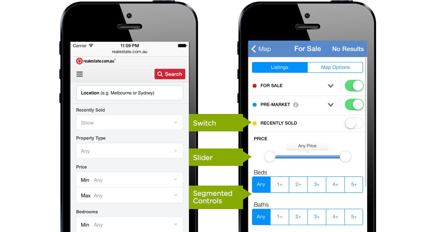
1. Responsive mobile navigation
Mobile users are very goal oriented: 75% of them expect to get information they need immediately. That means being able to navigate an application on mobile easily is essential to ensure a smooth user experience.
Instead of making users scroll through long pages, include a menu bar to enable users to get what they want much quicker. Navigation in mobile apps often comes in two forms or a combination of both: a tab bar and a navigation pane side drawer.
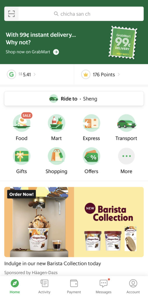
To simplify the process even more, you can also add a search bar like how Southeast Asian ride hailing giant Grab does on their app (pictured above). Users just need to type the first few letters of the food they are currently craving for, or the address they want to head to, and it intuitively predicts common search terms without requiring users to type the whole thing.
Remember to label buttons or icons with the proper attributes; use words used in daily conversations and avoid jargon so that users understand what it is for.
Another useful thing to have is the home button that brings users back to the main page, especially on your mobile site, so users don’t have to aggressively press the back button just to get to where they came from. Likewise, if your page is long, you should also include a ‘back to top’ button.
Additionally, when designing a mobile interface, think about hand-reach comfort zones.
Most people use a single hand and their thumb in utilising their mobile devices. Understanding your users’ range of motion will help design the mobile application, placing buttons in the appropriate place accessible and comfortable for your users.

2. Vertical formats
For the longest time, videos have been viewed horizontally, but most people hold their phones vertically, especially when scrolling through social media or surfing the web. Often, users have to turn their phone to landscape orientation to watch videos in a comfortable setting, which can be cumbersome especially for those who spend hours on YouTube!
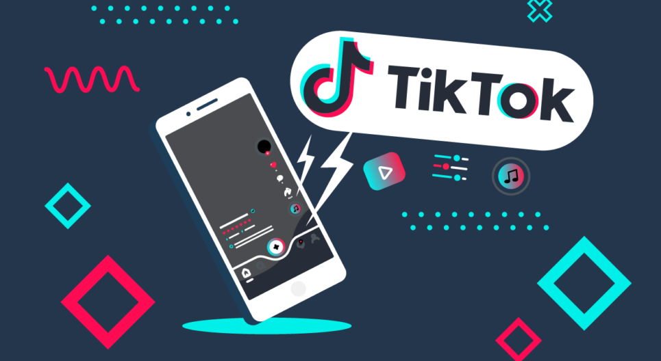
Therefore, the concept of creating vertical videos has been gaining steam for the past few years. With the prominence of TikTok and Instagram, vertical videos are not going anywhere any time soon.
Bear in mind vertical formats are not limited to videos only. Even when designing a mobile page or site, you should think of it in a vertical structure as well — remember to create a page with a clear visual hierarchy.
Consider how typography is being used to bring your message across to your audience. Use colours, varying font sizes, and font weights so that users will have a pleasant viewing experience when scrolling your page vertically.
3. Short and simple is sweet
When it comes to mobile devices, your space is limited; you do not have the luxury of a large computer screen so strip your content to the essentials.
Look at the difference between the desktop and mobile menu of J. Crew, a retail store. The menu on desktop comes with many options, whereas the menu on mobile comes with only the essentials or the most popular ones.
Keep your mobile pages simple; clarity is a characteristic of a good mobile design. Do not stuff too many elements like buttons, text, and images into your mobile page. Even with the largest phone screen dimensions, there’s still limited room to play with.
Try a minimal design to ensure better user interaction. Additionally, try incorporating icons to convey information, reducing text in the process. After all, a picture speaks a thousand words.
The minimal approach is also applicable to forms and links. Forms are more difficult to fill in on mobile than desktop, so make sure that the form fields only ask what is necessary to continue. No one likes to fill forms — to simplify the process even more on mobile, minimise text inputs (for less typing) and avoid drop-downs if you have lots of options (so less scrolling). Use checkboxes or simple buttons instead.
4. Accessibility is key
We have discussed the importance of having an ADA-compliant website.
Doing so will attract your business to more people, including the differently-abled. The same approach should be applied when you are designing a mobile site app.
Use colour combinations with high contrast to assist those who are colour blind or visually-impaired. Certain colours are also intuitively understood to mean something — like red for incorrect and green for correct. This is also helpful for the general user, as the information becomes so much easier to process at a glance.
Moreover, it would be best to offer other types of media to accommodate people with different disabilities, such as motor or hearing impairments. With an inclusive design, people from all walks of life can easily interact and utilise your product, giving you a better opportunity to connect with a diverse customer base and ultimately convert it to sales down the line.
It’s the little things that matter
Providing a good mobile experience is all about the details — consistency is key. By incorporating features and behaviors in ways people expect, such as universally-known icons, standard (and legible) text styles, and uniform terminology, a consistent design makes the user experience much more intuitive.
Nifty features like providing feedback also go a long way in ensuring a smoother experience. Feedback acknowledges actions and shows results to keep people informed.
Everyone’s been caught in that awkward stage when they can’t tell if the page is loading or if it’s just stuck. Why not include a loading screen or a progress bar to signal to users that things are working fine — they just need to be patient.
In the end perhaps the most important thing you should ask yourself is: does your mobile interface serve its purpose? How well does its appearance and behavior integrate with its function?
If your mobile interface is intended to help perform serious tasks, keep users focused by using subtle, unobtrusive graphics and predictable standard controls.
If it’s meant to be something for entertainment, like a mobile game, you have a bit more freedom to play with graphics and typography to make it exciting while encouraging discovery.
Creating immersive experiences on mobile
With the advances in technology, you can leverage augmented and virtual reality to enhance the user experience on mobile devices.
One example is that you can now take a peek inside of Buckingham Palace without needing to be there in person. You just need access to Youtube and a VR headset. Through the BBC’s official channel, you can walk through and explore Buckingham Palace in 360 degrees by turning your mobile device around.
With the example above, it can be said that the opportunity of creating an immersive mobile experience is limitless, especially as newer technologies continue to emerge. It pushes the boundaries of how your customers are interacting with your brand, giving them a memorable experience, which helps to keep your brand top of mind.
The now defunct Google Mobile Friendly Test used to be the go-to platform to test how mobile-friendly your site is. For now, you can utilise a new tool called Experte. The tool’s creators say it will crawl the entire website and determine the mobile friendliness of each page.
Creating a good mobile experience can leave a strong impression on your users, and it also makes them want to visit your site or app more often to consume your content, especially when they’re on the go.