How typography captures your audience
- SHARE ON:


Apart from just looking aesthetically pleasing, have you thought about how the typeface affects the messaging you are giving your audience?
Whether it’s an ad that we see on our devices, titles of books, or the look of movie posters, we are constantly exposed to various pieces of text in different shapes and sizes — it is all around us.
We see the words, but do we ever think about the designer’s vision and how we are subliminally picking up on the message they are captivating us with?
In this article, we will discover the depths of typography and explore the question: How important is typography in the design process, and how much consideration should be given to it when building or portraying your brand?
We will dive into what typography is, how it transformed throughout the different generations, and most importantly, how it can impact your users. Lastly, we will discover the various elements that make up typography and what they mean.
What is typography?
Typography is the art and technique of the shape, size and form of letters and the spaces between them. Every type has a character or personality to it that evokes emotions. When the type has a feeling, we can use that feeling to push the message out to the audience. It is an essential part of a designer’s journey.
Typography has a long and rich history and can be traced all the way back to the 11th century, where it began as a specialised craft. Although it was initially used for books and newsletters, it is now an integral part of our digital experience of the world.
Why is typography so essential?
More powerful than just choosing a good looking typeface, typography is a super component in establishing a strong visual hierarchy on any page or screen, providing a cohesive look to everything from an e-commerce app to a magazine article.
Typography can make or break your website’s overall feel. Your audience will begin to subliminally associate typeface with your brand. A unique typeface can for instance, drive a user following for your brand.
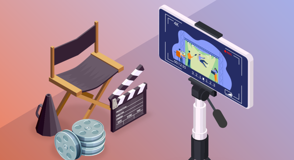
The power of typography in making an underwhelming video ‘pop’
The role of typography in video is often overlooked. Especially if you don’t have the best clips, or are working with generic stock footage, having powerful typography can engage your audience and make an underwhelming video ‘pop’.
A great example of this is the “Stomp” typography videos that are mostly found in text animations, where the text is the star of the show — it is loud, stands out and becomes a tool to cover the weaknesses of the base video. Here’s an example we made for Wolters Kluwer.
Depending on what you are going for in your design, designers intentionally choose the font that is most important for the messaging.
If you think the type’s aesthetic value is crucial to your brand’s messaging , you should pick it anyway even if it may not be all that practical.
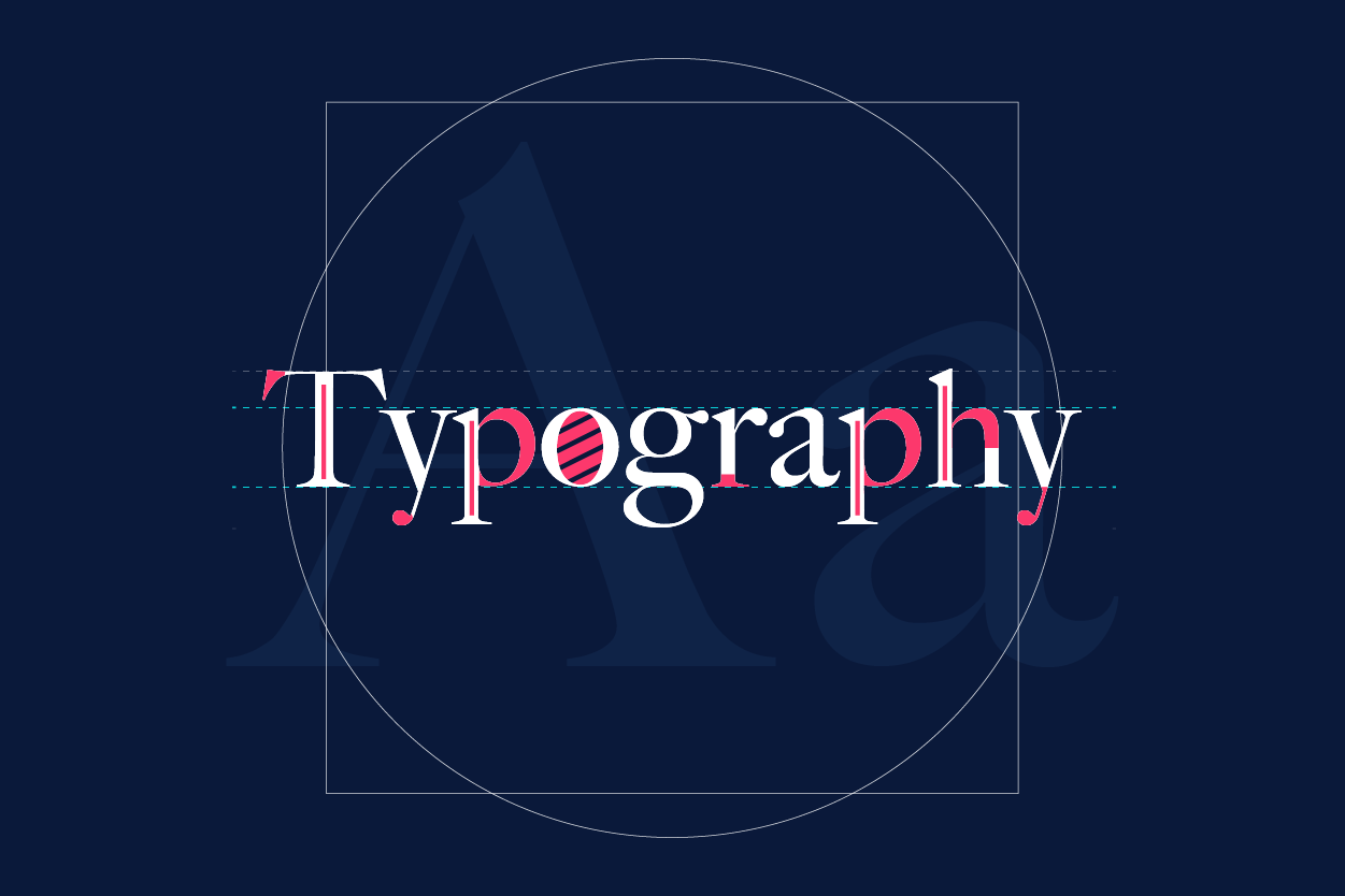
The different elements of typography
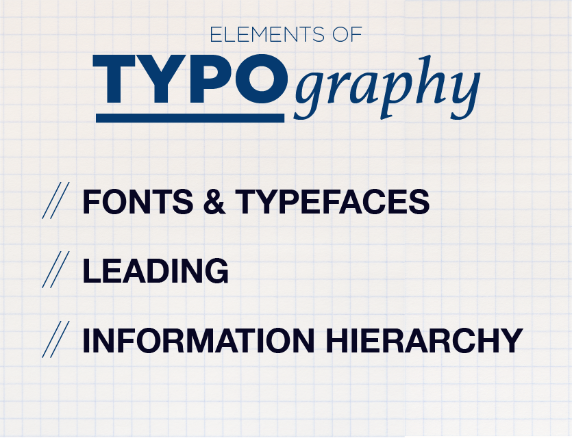
In this section, we will run down the differences between font and typefaces and the different elements of typography.
Fonts and Typefaces
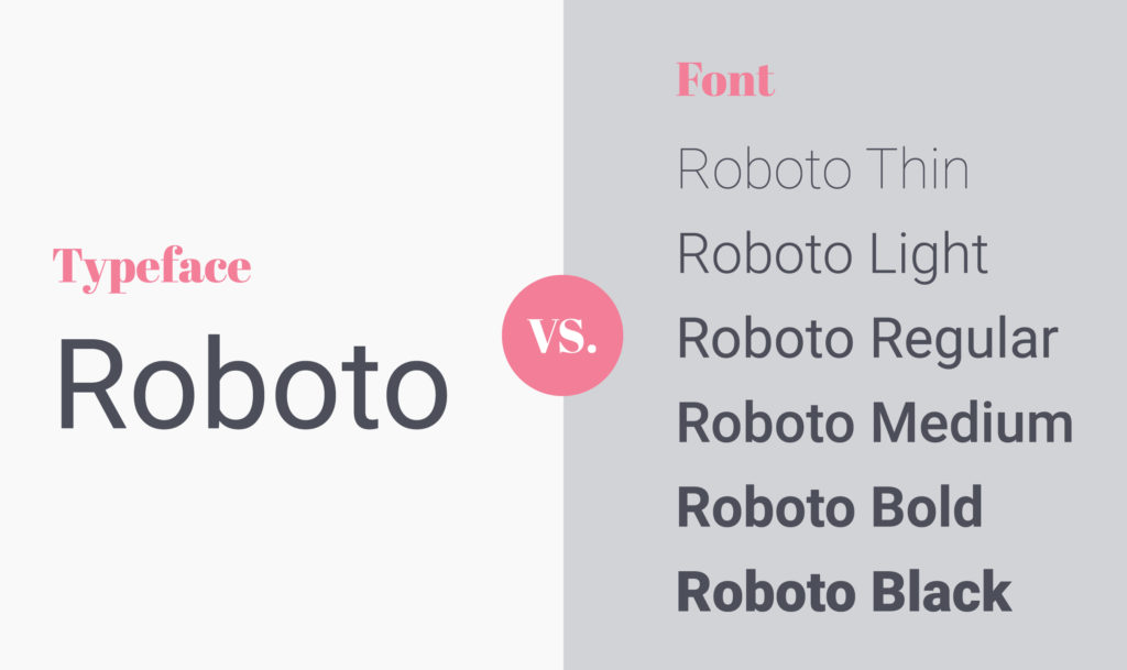
To the untrained eye, fonts and typeface can seem like the same thing, but that’s not true.
Typeface is the style of the design that uses a myriad of techniques and can be dependent on sizes and spaces, whereas font refers to the look, weight, width and style of the text character.
Here’s a short explainer on the difference between these two often confused concepts.
The two basic typefaces that are commonly used in typography are ‘serif’ and ‘sans-serif’. The main differences between both typefaces are the presence or absence of serifs within the letter. Serifs are more decorative and have “tails” or “feet’ ‘while sans-serif do not.
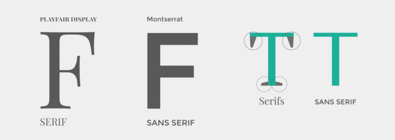
Pre World War II, typography wording was inspired by nature and so serif was the more popular choice for advertising. But with the rise of industrialism post-war, design preferences shifted and the once fancy design gave way to a more modern and scientific look — essentially throwing away serif and using sans serif.
However, that shifted when American graphic designer David Carson, best known for his innovative magazine designs, changed the scene with his bold and playful typography. As a result, modern graphic design utilises both sans serif and serif across all industries.
According to Victor Goh, Click2View’s Art Director, every type has a character and feeling — it is important to identify if that character gives or takes away from the overall messaging or visual.
He also shared that since typography affects messaging, it is in the designers’ best interest to decide on what they would want the visuals as a whole to communicate.
Leading
Leading is the spaces that are between two lines of types, measured from baseline to baseline.
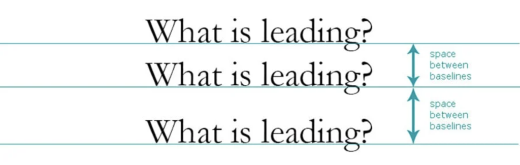
Leading is an element that can go unnoticed if you do not know what you are looking for or lack experience in typography.
It is an important step to make your text easier to read and allow your design to feel more balanced from an audience perspective.
Information hierarchy
Take for example a newspaper, on the front page, you would have the primary heading, secondary heading, tertiary heading and body of text.
Hierarchy in your design is a crucial principle of typography because it creates a clear distinction between different sections of copy, giving an indication as to what the reader should read first. Hierarchy can be created using different sizes, colours and alignment.
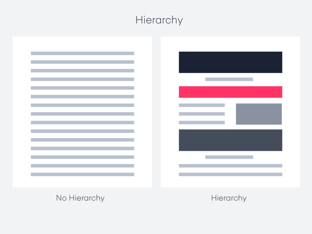
In this day and age, viewers tend to have a shorter attention span due to the copious amount of content accessible everywhere, in particular on smartphones and computers. It is important that designers focus on being articulate with type to attract the reader and allow them to consume the information easily.
As you can see, the font, leading and weight is a big part of the overall design process and is a craft that has many elements. Being aware of these different elements can be a determining factor in catching the attention of the audience.
Typography for content marketing
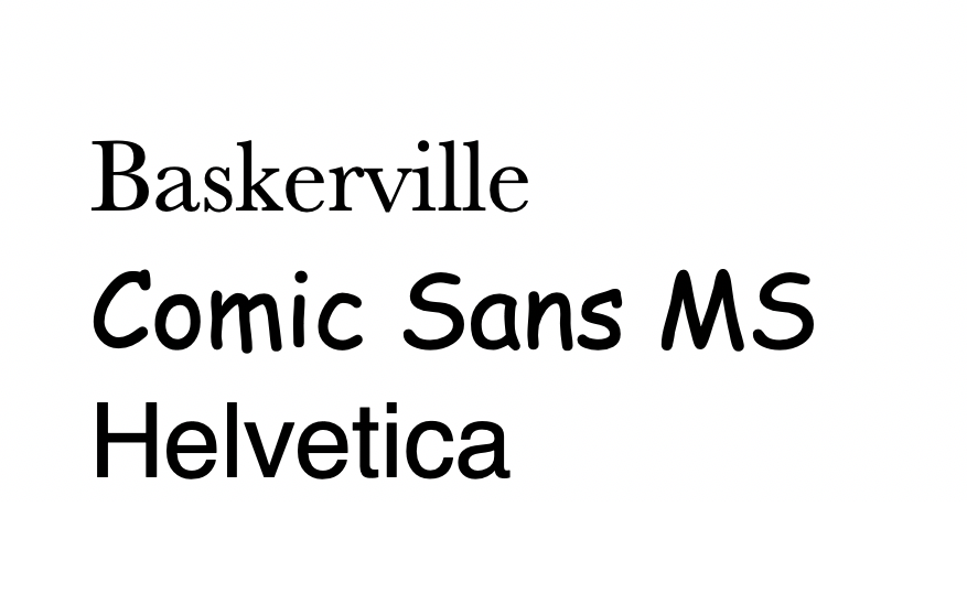
There has been a lot of research done on typography and visual aesthetics that affect the way we interpret information. The New York Times conducted an experiment in 2012 to test the effectiveness of typefaces, and they found that the passages that were written in ‘Baskerville’ were seen as more valid than those written in ‘Comic Sans’ and ‘Helvetica’.
This shows us that typography plays a huge role in your content marketing strategy.
Having a content marketing strategy is aimed at pulling in visitors to your website or platforms through the way your content is presented. The reason to invest in well-thought-out typography is to build trust with the customers, and choosing the right typefaces should be a priority as it forms the first impression you are giving your readers.
A lasting imprint
Typography is an art in itself and has a lot of depth to it.
From a designer’s perspective, mastering typography will set you apart and is a skill that is sought after by brands and companies that want to be unique and capture the hearts of the customers.
From a brand perspective, it is crucial to hire a designer that has this knowledge and skill as it is so much more than choosing a font, typeface, colour and design. There are tons of technical elements that are needed to capture, retain and build trust with your audience.
Capture the attention of your audience with clever typography. Contact our art director Victor at [email protected] today.
Read more from Click2View:
- The role of music and sound effects in your videos.
- How do you ace the Instagram Stories game?
- Explore the allure of animated content.
Sign up to our newsletter for a weekly update on the latest content marketing news. Don’t forget to subscribe to our YouTube channel too!
Click2View is Southeast Asia’s premiere full-service independent B2B content marketing agency servicing clients like Microsoft, Google, Visa, Prudential, and the Lee Kuan Yew School of Public Policy.