
The benefits of carousels

How do you catch the attention of a digital generation that’s addicted to scrolling? By letting them scroll — through a carousel.
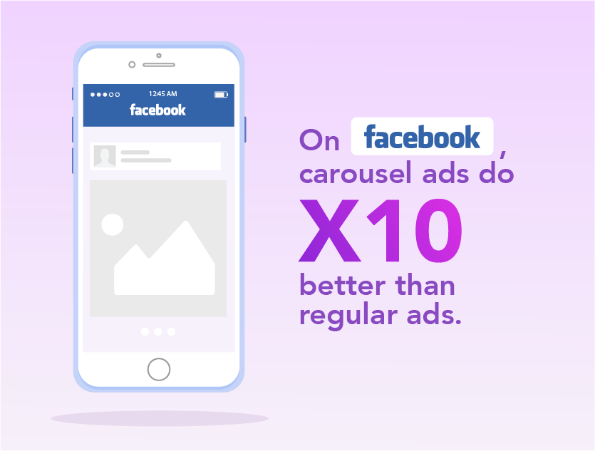
Carousels have been growing in popularity. First Facebook, then Instagram, and most recently Twitter — multiple social media platforms are now supporting carousel ad formats.
But what are carousels? And no, we’re not talking about the amusement park ride.
In the online world, a carousel is an advertising format that consists of a slideshow of images or videos (or both!) in a single post. What makes it unique is that users can swipe or click through them.
Carousels started on Instagram as regular posted content, mostly as a feature that would allow users to upload more photos at one go instead of being limited to just a single image per post. Since then, carousel posts have taken off and it has since evolved into an ad format as well.
But this is not the same across all social media sites. On Facebook and LinkedIn, carousels come primarily in the form of ads — not so much regular posts.
Carousels make good content

Aside from being visually pleasing and attention-grabbing, carousels encourage customer interaction with your content.
Scrolling through images or videos, whether to find out more about your product or to follow an interesting story, can help your brand leave a lasting impression on your customers.
Most social media platforms give you up to 10 carousel slides, and if you are putting out a Facebook or LinkedIn carousel ad, you can even put 10 call-to-actions — one for each slide. This means that you can prompt users to take different actions — from visiting your site to making a purchase — all in one ad.
Multiple slides give you more space for creative expression. With carousels, you can come up with some truly innovative stuff. We make carousels on our Instagram to accompany and summarise the key points of our blogs. Take a look at this adorable Halloween carousel we made for our blog on remote video recording platforms.
Our clients haven’t been missing out either. For UPS, we made a carousel telling the story of little Alex and his holiday saga and for Wolters Kluwer, our carousel was used to promote their new partnership with IMDA and show off their cloud-based platform with clean visuals.
Types of carousel use

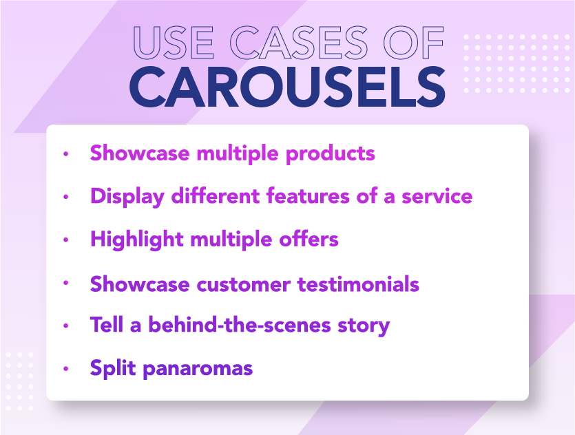
With the right amount of creativity, the number of ways you can use carousels are endless.
Showcase multiple products at once
Using carousels to showcase multiple products helps avoid cluttering your social media page (and your followers’ feeds too) with multiple posts. Plus, your customers need only scroll through one set of slides to see what your brand has to offer — a new line launch for example, making the customer experience much more convenient.
Luxury design brand Coach used carousels on Facebook to display products from its collaboration with Disney. The ad is sweet and simple — no text, no frills, just an image of a model holding the product — and most importantly, gets straight to the point.
Display the different features of a service
If your brand sells a service, you can use carousel ads to highlight several features, or you can walk them through the various ways your service can benefit your customers.
Or you can take a page out of WeWork’s book. With aesthetically pleasing images and concise taglines, their Linkedin carousel ad tells customers just how their service can enrich workflow.
Highlight multiple offers
Discounts are always welcome, but having to scroll through multiple posts to find that specific offer you want? Not so much. To make things easier on your customers, use carousels to showcase multiple discounts or offers at a go.
This Facebook ad from fast food chain Hungry Jack displays several mouth-watering images of food to leave you hungry for more (literally). Clicking the slides will bring you directly to a web page of offers and discounts from the brand.
Showcase customer reviews or testimonials
Customer reviews are an important factor in encouraging conversions. In this day and age, nearly nine out of ten customers will read reviews before making a purchase.
And if you’re getting good reviews, why not feature them on your social media handles, like this Instagram post from Kylie Cosmetics? Sharing positive reviews creates buzz around your product or service, and it is also a good way to build brand trust among your social media followers.
Tell a behind-the-scenes story
In an era of distrust, customers value authenticity in brands more than ever. In fact, for 86% of customers, authenticity is a key factor behind supporting or liking a brand.
To make your brand seem less corporate and more human, why not give customers a glimpse of the people working behind the brand with behind-the-scenes footage or images?
Sunergos, a coffee roaster and brewer in Louisville, gives users a walk through the brewing and roasting process through a carousel on their Instagram page, and demonstrates that their coffee is truly simply and naturally made.
Create a split panorama
If you want to incorporate aesthetically-pleasing photographs into your advertisement, consider using a panorama (a wide-angle shot that gives a complete view of an area) for your carousel ads. But here’s the catch – you split it.
Splitting the panoramic image into carousel slides will not only allow you to show off the environment in its entirety, but it will also encourage user engagement as they flip through the slides to see the full picture.
For example, this carousel ad for a rental car service in Iceland uses a panoramic image to fully display the beautiful Icelandic landscape.
Best practices for carousels

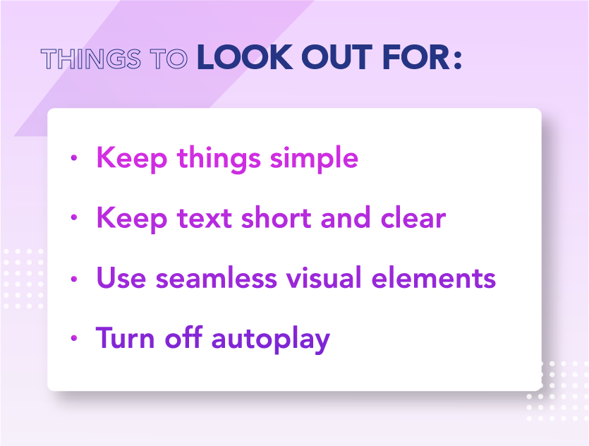
Simple is best
You’ll want a clean, easy-to-read image that draws the eye in, and that means striking the right balance between text and graphics.
Remember, no one is going to scroll through anything that is too complicated or convoluted.
Keep text short and clear
A carousel is most often viewed on mobile, and that means it’s tiny. You don’t have much space to work with.
Make sure all your text is concise, keep things legible with larger font sizes and always pay attention to font readability. Try not to fit too much text into one square frame; if your font size is too small, you can bet that no one will read through it all.
Use seamless visual elements
While you can create a carousel with standalone frames, it’s much less appealing. In the end, the allure of a carousel lies in its seamless scroll.
Try including visual cues or graphical elements that continue from one frame into another. Alternatively, you can split an image down the middle so it spills over into two or more frames (like that split panoramic effect we mentioned earlier).
Not only will your carousel look more cohesive, it also encourages scrolling. After all, people will naturally be curious to see what lies in the next slide.
Also it might seem like a no-brainer, but making the first image eye-catching always helps.
Turn off autoplay
One of the biggest mistakes when it comes to creating a carousel is making it play automatically, especially if your slides contain texts. Nothing is more frustrating than having what you’re reading move on before you’ve even finished.
Instead, allow your users to flip through the slides at their own pace. That’s not a problem if they are on mobile since users can just swipe through.
However, if you’re putting carousels on webpages for desktop viewing, you might want to consider using dot navigations (a series of dot icons that indicates how many slides you have) or just simple arrow signs to let them flip back and forth.
If you’re interested in making more social content in the form of carousels, let us help. Reach out to our digital specialist Praveen at [email protected]
Read more from Click2View:
- The WEF is coming to Singapore next year.
- What are some content marketing trends to look out for in 2021?
- This is what it’s really like to shoot sports car content.
- The pandemic has made us all tech-takers.
Sign up to our newsletter for a weekly update on the latest content marketing news. Don’t forget to subscribe to our YouTube channel too!
Click2View is Southeast Asia’s premiere full-service independent B2B content marketing agency servicing clients like Microsoft, Google, Visa, Prudential, and the Lee Kuan Yew School of Public Policy.


