
The subtle power of design for social media engagement

Written by Simon Kearney | Graphics by Yusak Prahadi
One of the most interesting aspects of social media at the moment is the subtle power of design.
Subtle design changes can have a massive impact on how content performs in the newsfeed. It’s not just about creating visually appealing content; it’s about understanding what resonates with your audience at a deeper level.
For instance, we’ve recently noticed a trend on TikTok and Instagram towards a minimalist and simpler, raw production style – often called “no-edit”. This trend is overtaking the highly-produced, “retention-edited” content full of graphics, sound effects, text on screen, and bubbly hosts.
Similarly on LinkedIn, simple and clean visuals, such as quotes or straightforward images, are currently generating higher engagement rates. The reason is, in a cluttered feed, minimalism stands out. It’s a conscious design choice. People are more likely to pause and interact with content that is easy to digest.
When you leverage design that is both creative and in line with the audience’s needs, you can create content that not only looks good but also performs exceptionally well in terms of engagement.
Content that is more engaging wins with the algorithm. The algorithm then points you to what else is working well. It’s an affinity loop. Content is basically a fashion business now. You’re trying to turn eyeballs and every day is a new season.
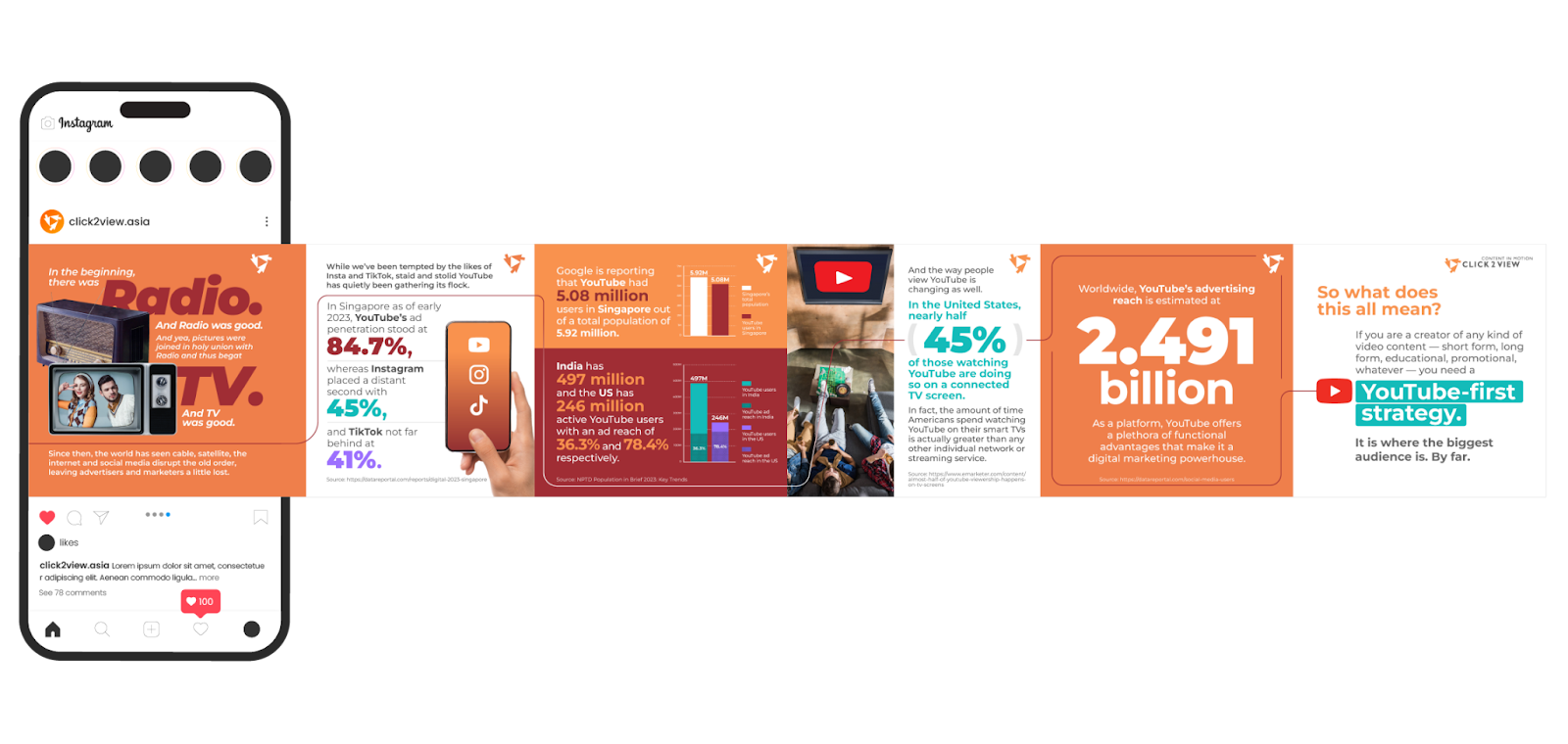
Just like in fashion, great design will always be a differentiator. For instance, we recently started experimenting with document ads on LinkedIn. But instead of promoting a whitepaper as many are doing, we created a carousel in a highly readable, visual-heavy, flowing infographic style.

The result, from our limited test, was a click through rate of nearly 4 percent, which is much higher than the benchmark. I’m confident it was the design of the document that made the difference.
But equally with fashion you need to understand some fundamental rules. In social media you need to understand the algorithm, understand the audience – which means using data and insights. The content planning, and reporting cycle slowly reveals these rules over time – and they are surprisingly consistent. Once you understand where and when you can leverage design as a differentiator.
There are several content formats and strategies that are currently outperforming others on LinkedIn.
- Simple posts, such as quotes, generate high engagement and click-through rates.
- Charts are highly engaging and effective at driving click-throughs. Animated charts, in particular, are emerging as a powerful tool for capturing attention.
- Vertical videos are outperforming horizontal and square formats, likely because they occupy more screen space in the feed, making them harder to ignore.
Applying some imaginative design choices to these to make an even bigger difference. For example, as we found with our document ad test, bleeding edge image carousels and a well-executed scroll can boost engagement by up to 300 percent.
To recap. Use design to achieve greater social media engagement. And don’t overthink it, sometimes simpler is better.
Read more from Click2View:
- Memes beat medals
- Content pruning: When and how to remove decayed content
- Which channel are you ignoring at your peril?
- The beauty and power of small creative victories
Sign up to our newsletter for a weekly update on the latest content marketing news. Don’t forget to subscribe to our YouTube channel too!


