7 Types of Infographics You Should Know
These infographic templates can make you stand out
- SHARE ON:


We’ve made the argument that humans are visually wired countless times, meaning that images are more memorable than words. This is especially true in a time when we’re bombarded with a daily barrage of information.
That’s why infographics have emerged as an effective tool to convey your message to the public, and why you should include them in your content marketing strategy.
But there are different styles of infographics which can best help you get the job done. For example, timeline infographics are useful when you want to present something in a historical context, whereas process infographics are ideal when you want to show a how-to guide with step-by-step information.
This post will guide you on the different types of infographics and when you should use each of them.
- Timeline infographic
This type of infographic is ideal when your goal is to visualise history or tell the audience the sequence of events (e.g. the timeline of COVID-19) or to set the audience’s expectations of how long a process is going to be, whether planning an event or getting COVID-19 vaccines approved.
Remember to use simple icons to signify the important points in your timeline.

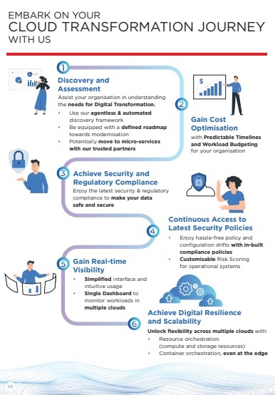
- Process infographic
Suppose your goal is to break down a complex process into an easily digestible one or to let your audience visualise a procedure and have a summary of each step. A process infographic does this with directional cues so viewers can follow the infographic step by step. As illustrated below (our work for ST Engineering), the S-shaped format has become a go-to design to save space.
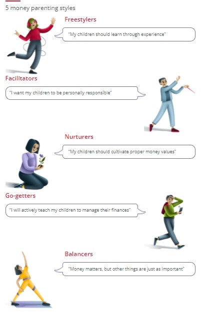
- Informational infographic
When you want to educate, inform, or familiarise someone with a new concept or give an overview of a specific subject, this infographic template can get your message across effectively. One example was when Prudential’s Eastspring Investments approached us to help them create an infographic introducing “5 Types of Money Parenting Styles”, as seen below:
- Map infographic
This template is ideal for you who wants to illustrate information based on location. When you want to show the controlled territory between the war that’s currently happening in Ukraine and Russia, for instance, a map infographic is the best option to present and communicate it clearly to your audience, as seen in the example below:

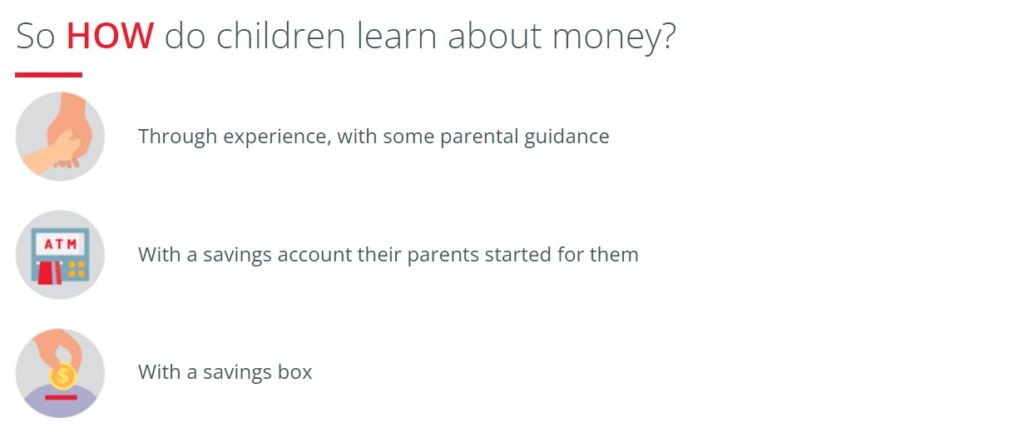
- List infographic
Are you planning to share a collection of tips, a list or examples? If you are, this infographic template is your best bet to get your message across efficiently. The template is generally straightforward, but it’s common to include visual icons with creative fonts and colours instead of bullet points. One example is our work for Eastspring Investments to show how children learn about money below:
- Hierarchical infographic
This infographic is best suited when you want to organise something based on its importance. One famous example of such groupings is Maslow’s hierarchy of needs, divided into five categories. The most important (physiological needs) is placed as the pyramid’s foundation, whereas the least important (self-actualisation) is placed at the top.
/4136760-article-what-is-maslows-hierarchy-of-needs-5a97179aeb97de003668392e.png)
- Comparison infographic
A comparison infographic is all you need to get the job done when you want to compare two different things properly. Whether it’s the latest iPhone 13 versus Android or the brandshare of Coca Cola and Pepsi, this template will surely come in handy!

The evolution of the infographic format
In 2011, Nathan Yau, the creator of Flowing Data, said that infographics had gotten longer to fit into the blog format. Posts that used to be a long list of favourite things and best methods have shifted to something more visual.” Essentially, giving prominence to the long, thin vertical scrolling infographic that may not necessarily provide the best user experience.
As time went on, however, it has evolved into a square-shaped format, making it easier to be viewed without scrolling on mobile and social media. The rise of Instagram has made the carousel format more popular, too, meaning that the infographic can be swiped, not presenting all the data at once, making it tidier to look at.
Regardless of which type of infographic you choose and how it’s presented, it can help you stand out in the sea of daily content to your audience if done right with the proper visuals and story flow.
Read more from Click2View:
- Leveraging Events for Your Content Marketing Strategy
- Our Valuable Ukrainian (and Russian) Animation Production Partners
- Redefining authorship with AI writing tools
- AI content creation tools that will blow your mind
Sign up to our newsletter for a weekly update on the latest content marketing news. Don’t forget to subscribe to our YouTube channel too!
Click2View is Southeast Asia’s premiere full-service independent B2B content marketing agency servicing clients like Microsoft, Google, Visa, Prudential, and the Lee Kuan Yew School of Public Policy.