The haunting of corporate memphis
- SHARE ON:


Is this flat illustration design favoured by modern corporations still in style?
Type in the phrase “design illustration” into your Google search bar, and chances are you will see hundreds of familiar minimalistic flat illustrations that have dominated the design aesthetics of most Big Tech and SaaS corporations, such as Hinge, Facebook, and Uber.
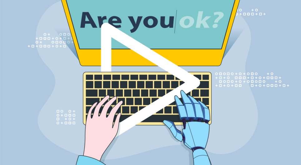
Often characterised as colourful, flat 2D drawings, this design style is centred around cartoonish figures with exaggerated body proportions and lanky limbs. Illustrations of humans lack individual identity, and tend to be ethnically ambiguous with minimal facial features and colourful skin in shades that are not quite human — including pink, purple or even blue.

This design style has many names, including the no-brainer ‘Big Tech Art Style’, ‘Corporate Art Style’, or even the term ‘Corporate Memphis’. While it might be wildly popular and trendy, there’s also a growing wave of people who beg to differ.
Falling into the trap
The existence of the style can be traced back to 2017, when Buck, an American design firm, created an illustration art called Alegria, the Spanish for ‘joy’, for none other than social giant Facebook. More and more companies followed Facebook’s lead in adopting such a style and it has become mainstream today.
And for all the things we have to say about it, we’re not exempt either.
As a content marketing agency, we have adopted this style on a few occasions for our clients. When ST Engineering approached us to help them create an animated explainer video of their new AGIL Cloud Management Platform, we opted to go down this design route.
Another example was when we created an animated video showing 40 years of contact lens wear for CooperVision — evidence that this style is no longer confined to the tech world but has also spread to other industries.
While such styles may be bland for some, our clients are satisfied and display these videos in their stores and on their websites, achieving our goal of fulfilling our clients’ needs.
“Indeed, the Corporate Memphis style is a safe approach and inoffensive to most people. That’s why the style is everywhere. But keep in mind that you’re selling a story at the end of the day; emphasise what your brand can do through storytelling. You can connect to your audience emotionally and differentiate yourselves that way,” says Artur Akhmetzyanov, our scripted content director and Head of Animation.
Playing it safe
In a world where brands are eager to portray themselves as diverse, perhaps depicting people not to scale and in unnatural skin tones makes it easier to be considered inclusive — nevermind the fact that blue-skinned people don’t exist.
The scalability of the vector graphics used to create these characters means that anyone can make edits to its size and colours.
What’s more, you do not need to have much experience to create graphics in this style. Through templates available on various platforms, such as Canva or Freepik, you need only purchase the template and edit them as you wish.
With a greater focus on web user experience, many companies have migrated to a more minimalistic approach since simpler designs take a shorter time to load.
Truly passé, or is it just unwarranted hate?
As noted by tech writer Claire L. Evans, Corporate Memphis makes big tech companies look friendly, approachable, and concerned with human-level interaction and community – which is largely the opposite of what they really are.
In an effort to signify representation and diversity, these characters get turned into something that no longer represents or even accurately reflects reality — a CNBC video report that found the tech workforce mainly consists of white males.
To stand out and be different from your competitors is the goal of every business. It helps you build a brand presence while making sure you’re easily recognised by the public.
However, with many companies using the Corporate Memphis style, it’s harder to differentiate them from one another, as pointed out by Jimmy Daly, a marketing director, back in 2019.
The homogeneous style even has a meme life of its own and is often parodied on social media, possibly giving bad press to one’s company.
Embracing the Corporate Memphis style is a double-edged sword since it offers simplicity for everyone, including startups, to create the designs they need with ease.
On the other hand, It makes it harder for you to make yourself unique and does not necessarily reflect what is going on in society. In the end, you should weigh the good and bad carefully before deciding which design style is appropriate for your business.