Producing a ‘weekly’ newsletter: lessons learnt
- SHARE ON:


We’ve been running our own weekly newsletter called Content Confidential for the past three years — here’s what we learnt so far.
One day in mid-2017, we sat down and decided we wanted to publish a newsletter — and so we did it.
Alright, it’s not quite as straightforward as that but you get our drift. We’ve been doing it ever since: one issue every Thursday, delivered straight to the inbox of our clients and contacts. It sounds easy, but the truth is every issue we put out involves the entire creative team.
Overseen by CEO and editor-in-chief Simon Kearney, our newsletter is actually ghost written in his style and voice — based on a process similar to the one we use to identify ghost writers for our C-suite clients.
Our Editorial Content Director Tim Colman is the head writer, while our Art Director Victor Goh designs the accompanying visuals. The branded content picks are contributed by Artur Akhmetzyanov, who’s our Head of Scripted Video & Animation. At the same time, they have support from the rest of the editorial and graphic design departments.
This process of working together, week after week on this internal project, gave us the freedom to experiment and improve our skills without being constrained by client briefs.
The result? A passion-project-turned-sales-lead-generator that we are so incredibly proud of — Content Confidential.
How did it start?
The idea of having a Click2View newsletter came from running newsletters for various clients and advising them on consistency when it comes to format, topics and distribution.
“We decided we needed to practice what we preached. As a content marketing agency, we should be producing content too, and so a weekly newsletter seemed like a great way to get into strong content habits,” says Tim.
He continues, “After all, it is only by doing it ourselves that we would be able to improve and learn tips that we could then share with our clients.”
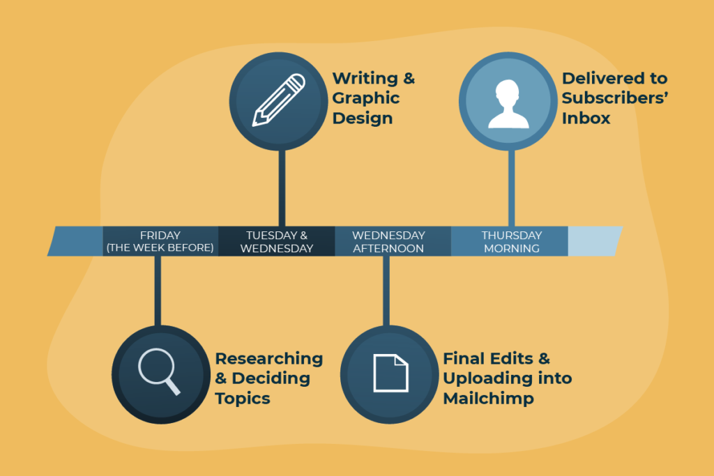
The newsletter production workflow repeats itself on a weekly basis: researching and deciding topics by Fridays, writing and graphic design on Tuesdays and Wednesdays, with final edits on Wednesday before they get uploaded into Mailchimp to be sent out first thing Thursday morning.
Our newsletter format
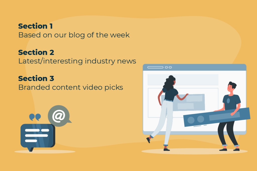
The current edition of the Click2View newsletter consists of three main sections:
- The first section is led by our blog of the week. The idea is for this to function as a storytelling blurb: whatever topic we decide on for the blog, we make three related points, supported with references from reliable news sources.
- The second section revolves around another current or timely topic in the content marketing or digital marketing world that we find interesting. They’re often bits of industry news that are related to each other, which we then string together into a cohesive narrative.
- The last section is titled ‘Click to View picks’ — a pun on our name, if you haven’t realised — and it is a list of five branded content video picks that we’ve curated from the past week. They are all accompanied with a one liner description about the video, as well as the links to the videos on their original landing pages; they’re not embedded in our newsletter.
But that’s not how it always was. In fact, over the course of the past three years, we’ve given it quite a few updates in terms of format, visual design and even content.
“Initially, it was supposed to be an outlet simply for sharing branded and marketing videos that we thought were well-produced, funny or memorable for some reason, all accompanied by a long description,” says Tim.
It was only later that a news section focusing on the latest developments in our industry was added. It may be our job to read and stay up-to-date about what’s happening in our own field, but scrutinising and curating stray bits of information into a cohesive newsworthy headline requires effort and helps hone our editing skills.
At the same time, we scaled back on the video descriptions. We wanted a “less is more” approach that would entice people to actually watch those clips and experience them the way we did, instead of being put off by our wordy reviews.
Ten branded content videos, comprising of a mix of animation and live action clips that are freshly produced in the past week, are first selected by Artur. This list then goes to Tim and the rest of the team, who then whittle that number down to five to be featured for the week.
For Artur, the selection process starts with him looking through a comprehensive, already-curated playlist of brands and filmmakers who consistently put out good content to see what new stuff they’ve recently produced.
“The whole idea is to put together a list of fresh content, so I rarely pick anything that wasn’t just released in the past five days or so,” he says.
Apart from looking at the time factor, another criteria for selection includes ensuring that there is diversity in the video picks, in terms of brands, types of industries as well as video types.
“For example, if I’m looking through the list and I realise three of them are car brands or related to the automobile industry, I’ll be more critical and pick out the best. This is so I can include other brands or other types of videos into the list, and it doesn’t get too repetitive,” says Artur.
He continues, “I try to pick videos that are in line with the kind of videos we make, such as product explainers and case studies, but quite a few of these videos selected do end up to be consumer-facing commercials, because those tend to be more fun and creative.”
The importance of visuals
Bite-sized bits of information that were easily digestible on-the-go — that was our goal. We always preach about the importance of visuals, and we took our own advice. To make it more visually appealing, especially on mobile, we decided to add more graphics.
If you’ve read our newsletter, you probably would have noticed the GIFs, which are custom designed week after week by Victor. If not for him, the cohesive visual themes of each issue truly would not have been possible.
Why GIFs?
The idea to use GIFs was first pushed forth by Simon. Originally, it was just to utilise clip-art style animated images with minimal movement from Canva, but that ended up being constraining from a design point-of-view.
Canva only had limited assets, and most of them were not quite able to bring out the nuanced meanings of our newsletter topics and what we were trying to say.

Made with Canva, for the issue on Native Advertising. Anyone who sees this, won’t quite ‘get’ the topic at first glance.
“By week three, I got so frustrated by the lack of options and quality that I decided I would animate my own GIFs that would be better suited to the topics every week. Simon loved the ones I made, and I’ve been creating my own ever since, ” says Victor.

Juxtaposed against the earlier GIF, this custom-designed one brings forth the idea of Content Amplification almost instantly.
Not to mention, creating our own gifs meant we could inject humour into our newsletter too.

Here’s how the designing process goes:
He first reads through the newsletter and picks up key things that would be interesting to show. Each topic usually has a few points, and sometimes the best one to animate isn’t related to the title of the section itself.
With some ideas in mind, he gets drawing on Adobe Illustrator, which helps him get a better idea on how things should be animated. Each drawing is then finally brought to life on After Effects.
Lessons learnt
After so many editions, the Click2View team has definitely learnt a thing or two about writing newsletters.
Perhaps the first major hurdle we had to surmount was figuring out the initial workflow.
For Tim, the biggest issue was having one person in charge of everything, which meant that great videos and news angles could be missed. But now research, writing, content direction, graphics and layout design is spread across the entire team, meaning there’s an influx of different ideas from a range of different people, but no single person gets bogged down in the production of each issue.
A pro tip from Tim: “If you’re going to do this type of thing in-house, you need regular deadlines for each member so production comes together smoothly and everyone has a chance to offer new ideas, opinions and concepts each week.”
On the design side, to make the workflow easier, Victor gives himself some rules while creating the GIFs. Sounds ironic to impose limits on creativity, but working with such ‘constraints’ forces him to think outside of the box to create fresh new GIFs every week that essentially fall within the same design ‘template’.
“Some rules I stick to include the colour scheme (only white, black and orange), illustration style (everything should appear solid and bold, no transparent elements, 2D shapes), and trying as much as possible to limit the GIFs to 2 seconds each. It’s easier to be consistent that way.” he says.
By keeping all the GIFs within these boundaries, it becomes much easier to decide how feasible it is to animate something, especially if the concept is too complex.
Working on the newsletter has also been great practice for him when it comes to finding alternate ways of representing something. A tip for working with abstract topics? “Think laterally, rather than approaching it directly,” he says.

Like this GIF above for our issue on The Rise of Personal Media Brands, which demonstrates how personal media brands are eclipsing traditional news hubs in a fun, creative way — we can actually see how the news is fighting for the viewers’ attention.

Or this one used to demonstrate the idea of maintaining consistency across everything you do, for our issue on Achieving Content Consistency.
In an effort to streamline our newsletter campaigns, Simon also conducts a frequent review of the subscribers list based on analytics of our open and click rates.
“If I notice people who are not opening or engaging with the newsletter, I remove them from the subscription. I don’t want to clog up their inboxes, and I’m really only interested in subscribers who are genuinely engaged,” he says.
Building a content hub
Once we got the newsletter (built off our weekly blogs) up and running, we also use it as a lead into the Content Show. This is also a way of repurposing content for the different audience demographics that we are targeting on various platforms.
In essence, we’ve managed to connect three different content streams — but they essentially come from a single source and feed off each other.