
Refresh Your Visuals With These Animation & Motion Graphic Trends
Motion graphics and animation are powerful marketing tools, especially as an alternative to live video productions. Here are some of the biggest trends in the industry in 2020.
Reeling from the impact of the ongoing COVID-19 pandemic, the media & entertainment industry has been massively affected. Many movies and TV show productions are being put on hold. Even advertising and corporate video shoots have been cancelled or postponed indefinitely.
One great alternative to filming live with talents and crew is to use motion graphics and animation instead. This medium is versatile enough to hit your marketing and communication objectives. Use it to introduce your brand, explain how your product works or even share thought leadership content. Best of all, since there’s no need for people to gather on a live set, it complies with current COVID-19 social distancing regulations as well.
Our head of scripted video & animation Artur Akhmetzyanov curated current trends in motion graphic and animation, along with some stunning work by designers from all around the world. Some of these trends have been around for the last few years and will probably continue to be relevant well into the future.
Watch as we discuss some of 2020’s biggest motion graphics and animation trends
Mixed media (3D, 2D, VFX, CG)
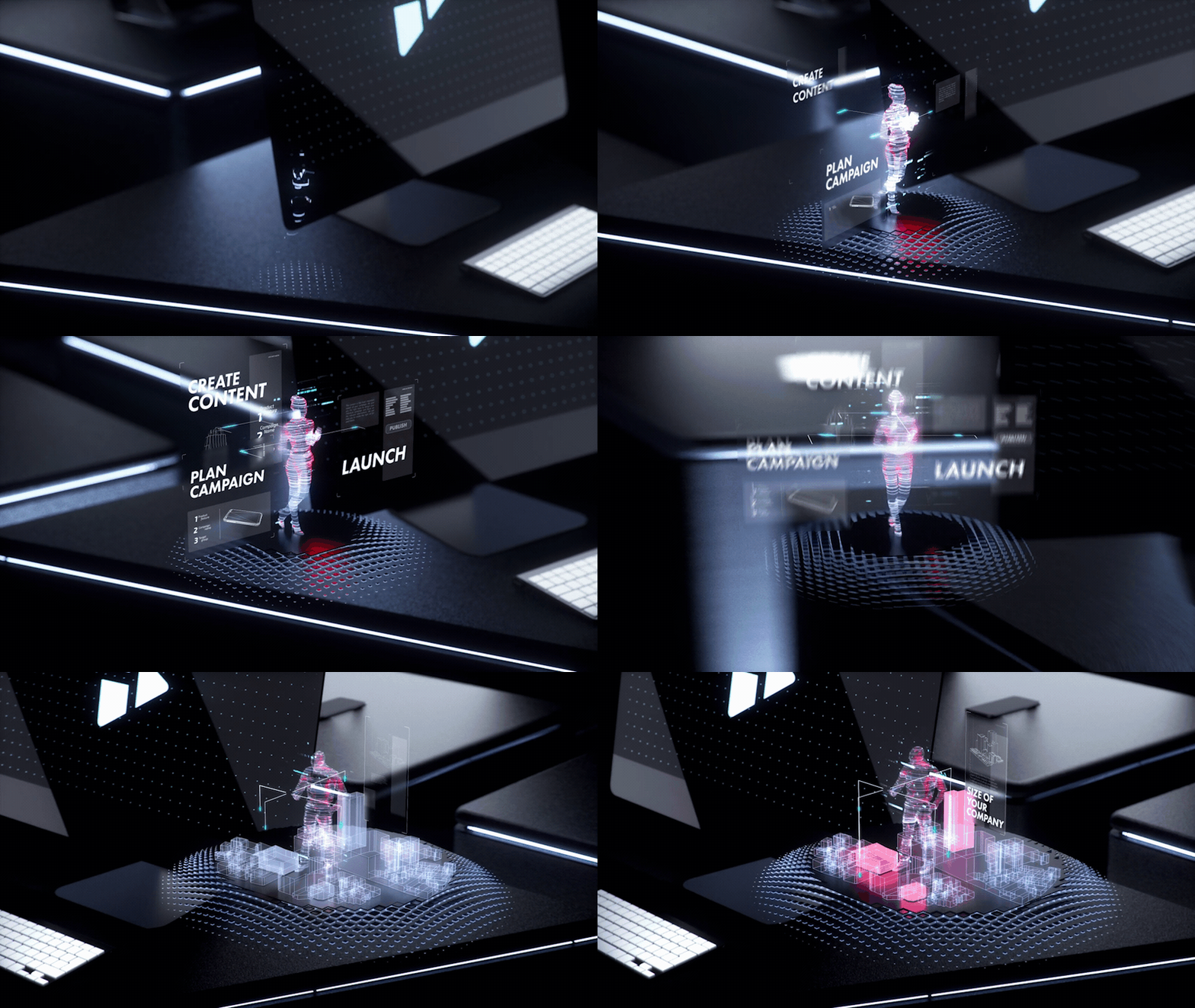
HYGH — Vision Movie by Stanislav Yakymenko
Sometimes, what you need is a good blend of various techniques to wow your audience. This is where the fun comes in — mixed media can comprise any combination of existing techniques.
Captured in a sequence shot, live action is blended with 2D and 3D animation as shown in this behind-the-scenes video.
Mixed media is also a good way to let your products stand out by highlighting its details.
Need to disseminate information and keep viewers engaged? Use mixed media in a video infographic. Stunning and breathtaking, this blend should be on your list for sure. Be ready to invest a bit more time and resources into it.
When it comes to packaging your brand’s concepts and ideas, create an experimental look with mixed media through its dynamic graphic design and composition.
Mixing up various types of media not only looks visually sophisticated, but it’s also a good way to show off your design skills.
Integrating 2D and 3D animations can be both a commercial and creative decision. If you lack the budget for a full-fledged 3D animation video, mix in some flat 2D with 3D motion graphics for depth and volume. It’s a cheaper way for brands to get the best of both worlds.
This mixture of 2D and 3D can be used to craft an animated film or even fan art, since they boost the range of movements that each character can have.
Isometric
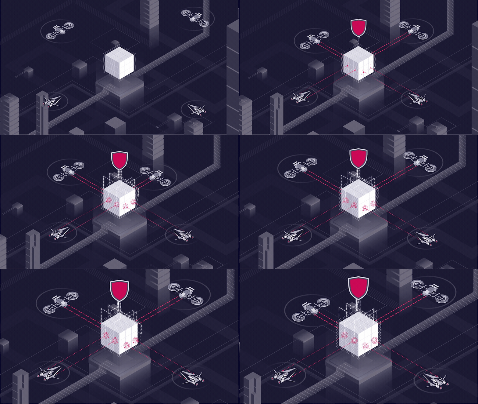
Blockchain Video for Buglab by Yans Media
Have you ever seen an icon that has depth, and looks raised off the screen? Chances are, it’s an isometric icon, created in the isometric design style. Put simply, isometric design is the method of presenting 3D objects in a 2D space.
An isometric design uses shadows and is an alternative perspective to create an illusion of three dimensions, adding depth to an otherwise flat design.
The combination of simplicity, along with the visually-pleasing colour schemes make this technique quite popular.

Kinetic typography
Gazprom Neft Promo Video by Lemons Studio
Kinetic typography is a design trend that quite literally puts a spin on fonts and typefaces. Traditionally, designers tend to stay away from experimenting with words for fear of causing issues when it comes to readability. Until now, that is.
In fact, moving typography can actually draw even more attention to the message that you are trying to portray. These movements and the meanings of the words themselves actually go hand in hand.
If you have a large amount of text that you want to fit into a short video, you might want to opt for a kinetic typography that allows you to use a broken text style. Stretch, rotate, twist and morph words and alphabets in all directions — the sky’s the limit!
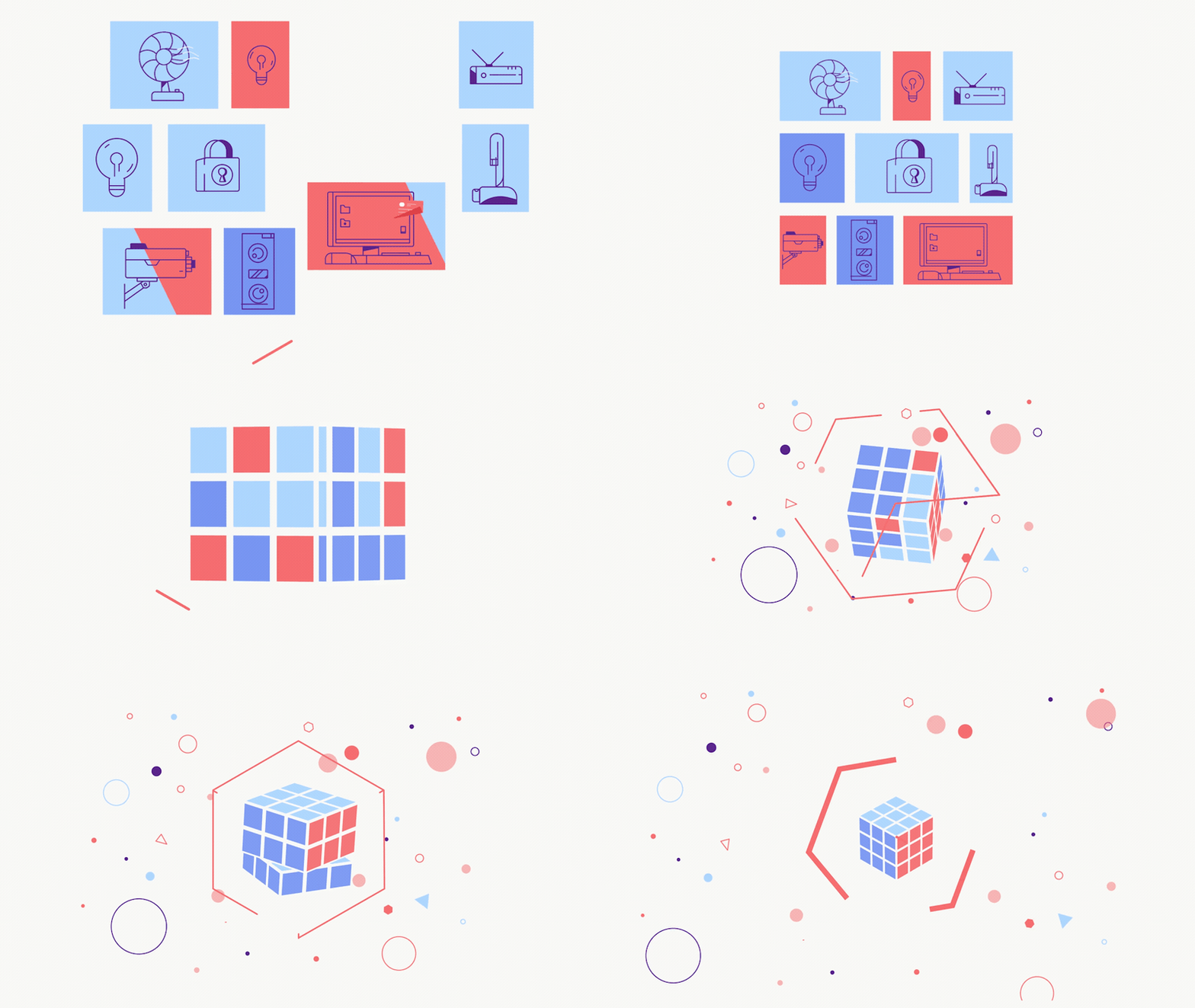
Thin lines / Outline
Builldie/Explainer video by Vladimir Marchukov
Simple yet still providing an endless stream of possibilities, lines are the basic building block when it comes to design. The secret here lies in minimalism — lines can be used to add subtle details to elevate the quality of your animations, adding a sleek dimension to your work.
Lines can be used to create new objects and characters. These days, they’re also being used to recreate the effect of hand-drawn art that’s both quirky and fun — a nod to the early days of animation.
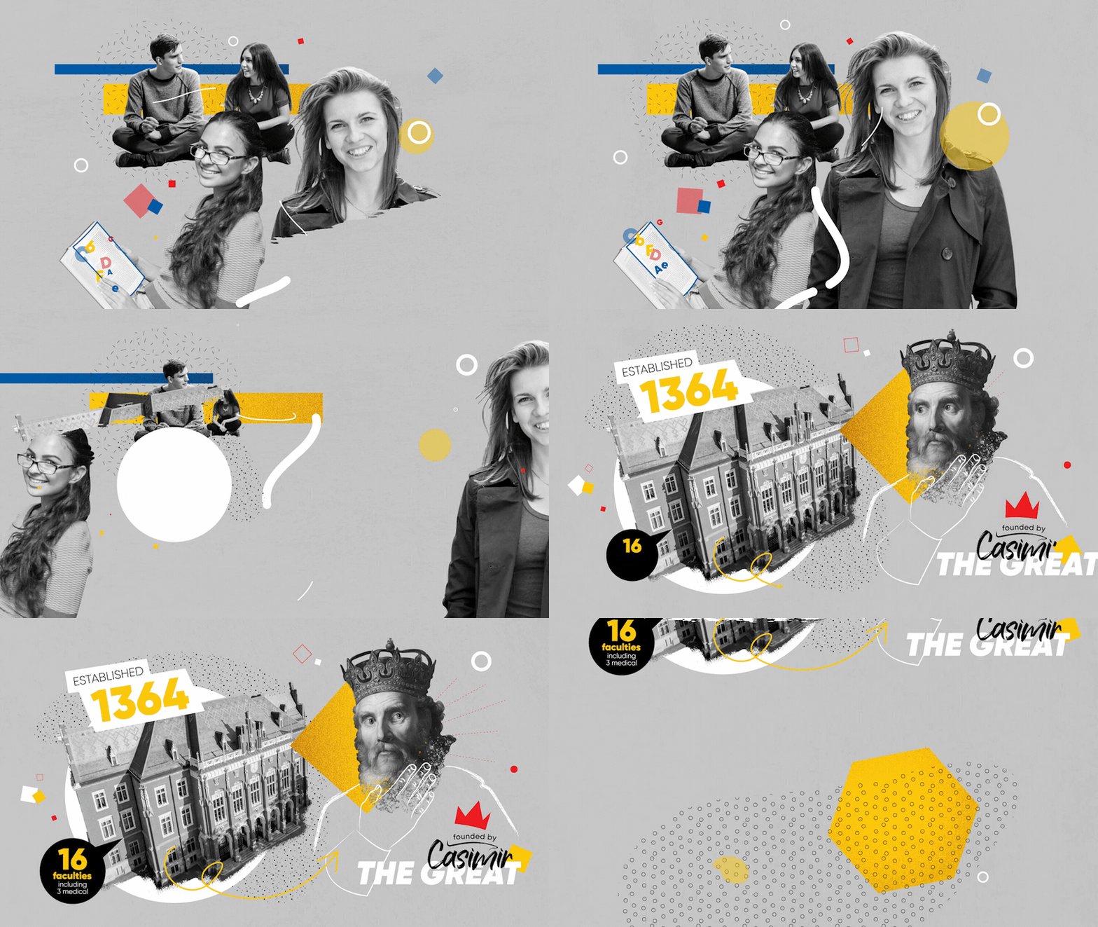
Retro / Nostalgia
Jagiellonian University Animation by Fromsquare
Let’s face it, everyone is a little nostalgic for the old days. There’s just something about the past that makes us all look back fondly upon it. It should come as no surprise that even motion graphics and animation trends in 2020 involve incorporating some old school elements as well.
Vintage-inspired animation can be delivered through the use of a grain effect and a limited colour palette.
Simplicity is key. A subtle nostalgic charm can also be brought back through the use of minimalism, in the form of simple shapes and flat animation. No fancy details required!
Nothing screams retro quite like an image collage. A paper cut-out animation technique can create the same effect that is also reminiscent of the past.
Seamless Transitions
Hello World by Aslan Almukhambetov
Please your visual senses through the use of seamless transitions in your animations. This effect often involves an object or scene morphing into another with an almost liquid motion.
Designers these days are trying to reduce the number of cuts in a video in order to create a natural, uninterrupted flow that works as a visual magnet to keep viewers engaged. And we’re telling you, it works — they’re absolutely hypnotising to watch.
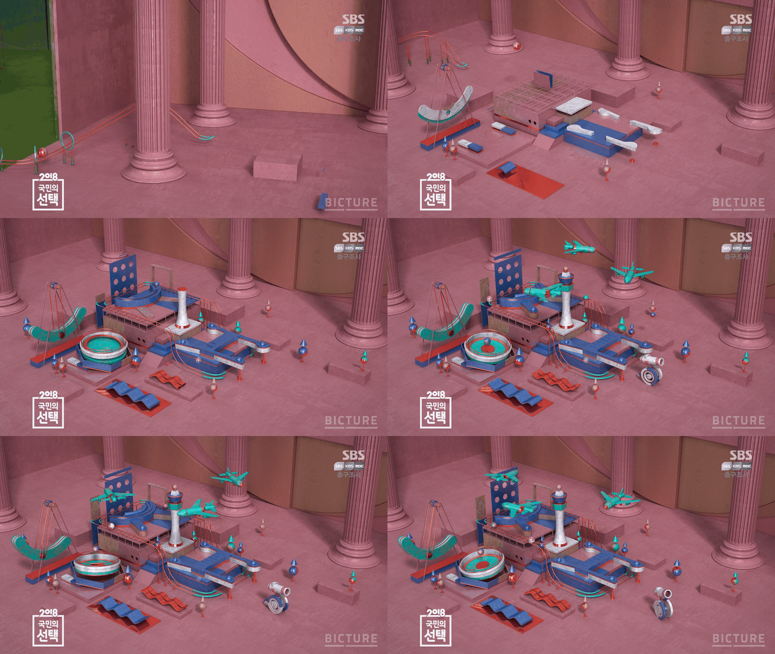
Digital Surrealism
2018 SBS Election by BICTURE Studio
When you let your creativity run wild, the possibilities are truly endless. Digital surrealism presents a world that’s filled with objects that seem to be at once familiar and yet fictitious. Everything is not quite what it seems to be, as ordinary objects and buildings are made to behave in unexpected ways.
Digital surrealism, to sum it up, is basically like magic. Simple daily objects merge in unexpected ways to create new forms, and are amplified with wild colours to create a captivating imagery.
Trends and examples were curated from the following sources: Behance, Webdew & Medium.
Staying inspired
A word of caution: despite the popularity of certain styles, the nature of your video ultimately dictates the theme and look that you should be going for. In the meantime, if you ever find yourself stuck in a creative rut when it comes to creating a motion graphic or animated video, you can always look to these trends for inspiration.
Have an idea for your next great animation? Talk to our scripted content director Artur Akhmetzyanov at [email protected].
Read more from Click2View:
- The key to an effective content strategy lies in content consistency.
- Business continuity is easier to achieve if you have a digital content marketing strategy in place.
- Ever wondered how different work might be after the COVID-19 pandemic?
Sign up to our newsletter for more.
Click2View is Southeast Asia’s premiere full-service independent B2B content marketing agency servicing clients like Microsoft, Google, Visa, Prudential, and the Lee Kuan Yew School of Public Policy.


